- by darkwizard3000 |
- Photography
- | Submitted on 12/29/2008 |
- Skip
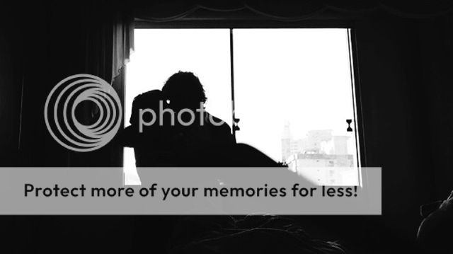
- Title: People
- Artist: darkwizard3000
- Description: My sister... It seemed cool...but what do I know!??!
- Date: 12/29/2008
- Tags: people
- Report Post
Comments (6 Comments)
- skillzyNINJApanda - 07/23/2009
- Some photographs look better without being centered because it causes more of a flow and you get more of an idea of where she is and how the background looks. Awesome pic and very good quality. No cropping needed.
- Report As Spam
- Sensation Ari - 01/05/2009
- Very cute picture. And I disagree, I think it looks good without cropping. (:
- Report As Spam
- elemental_sword_RP - 12/31/2008
-
the black and white is a nice touch. it's a great picture, but the left side seems rather empty. next time you have a wide open space that isn't the focus of the picture, try croping it a little.
your sister is also very photogenic - Report As Spam
- Tina Criddle - 12/30/2008
- why did you choose black&white over color
- Report As Spam
- LaraofSquad6 - 12/29/2008
- awwww...this is such a cute picture....she has an adoriable smile...
- Report As Spam
- Paladin-Prince - 12/29/2008
- Your sister is very pretty.
- Report As Spam


