- by reject4lyf |
- Photography
- | Submitted on 09/20/2008 |
- Skip
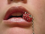
- Title: eat your heart out
- Artist: reject4lyf
- Description: i think it looks good, but critique and comments are appreiciated
- Date: 09/20/2008
- Tags: heart breaker
- Report Post
Comments (7 Comments)
- bleeding_masscara - 09/28/2009
- It's not bad....The focus is a little bit blurry. And instead of putting the heart chain on the side, I would take the chain off and put the heart its self in the middle of your lips. I mean that's what I did when I did something similar to this, except mine was a green sequine. You should try it and post it up here. Actually I would really like it if you could PM me if you do another one.
- Report As Spam
- SideshowLoki - 05/09/2009
- I don't see an actual focus in this shot. If it's the heart, I would of done a slight side profile shot instead of a head on shot. The open mouth seems to me a bit too tacky and the color of the lips doesn't match the heart.
- Report As Spam
- Twankiie - 05/09/2009
- It's a bit on the small side so details are harder to see. She has nice lips, but I agree, adding a bit of color could have really made this image pop. Making the necklace a more focused point would have been better too--and I think there is too much slack on the right side of the image. Every time I look at it, I feel my eyes being taken directly out of the image instead into it because of this, and that's something you want to avoid.
- Report As Spam
- Susannah6 - 09/21/2008
- Would be gorgeous without the keychain or whatever. Subject has beautiful lips. Cain and strawberry take away from them..
- Report As Spam
- T w i s t e d Conspiracy - 09/21/2008
-
I do believe I've seen this before.
:U - Report As Spam
- Mercedes_88 - 09/21/2008
- Intersesting =]
- Report As Spam
- chocolate-chacer - 09/21/2008
- i agree with the red lip comment. other than that, its good!
- Report As Spam


