- by cartoonluver |
- Painting And Drawing
- | Submitted on 09/25/2011 |
- Skip
Comments (4 Comments)
- way2strange - 09/29/2011
-
And for the hair, don't be afraid to go back in with an eraser to add highlights.
And add more lights and darks to your piece. To help to see if your shading just blends together and it looks flat, stand your piece up on something and step a couple of feet away. If it looks flat add more lights and darks. smile
Hope this helps. - Report As Spam
- way2strange - 09/29/2011
- If your going for realism, try to make sure your outline isn't so dark. The different forms of her face and body should be distinguished between the difference in shadows. If you look at us in real life, we don't have outlines. We have shadow.
- Report As Spam
- way2strange - 09/29/2011
-
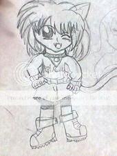
I would always make sure to scan it in rather than take a photo of it. Usually a point and shot camera can't focus on it and it because blurry. And try to crop it so we don't see the background. So leave like a 1-2 plain white boarder on around the outside of your piece. I usually use masking tape for this. I usually put the tape on my shirt a couple of times so it loses its stickiness so when you pull it off when your done it doesn't tear your paper to shreds.
- Report As Spam
- Sunny-Sama - 09/26/2011
-
Great start!
Her shoulders look a little too small.
The only other thing I can say is study anatomy, and keep up the good work!
^ ^ - Report As Spam


