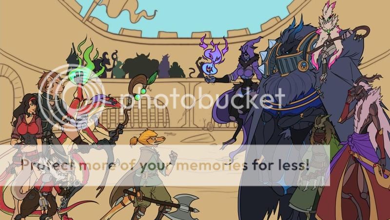
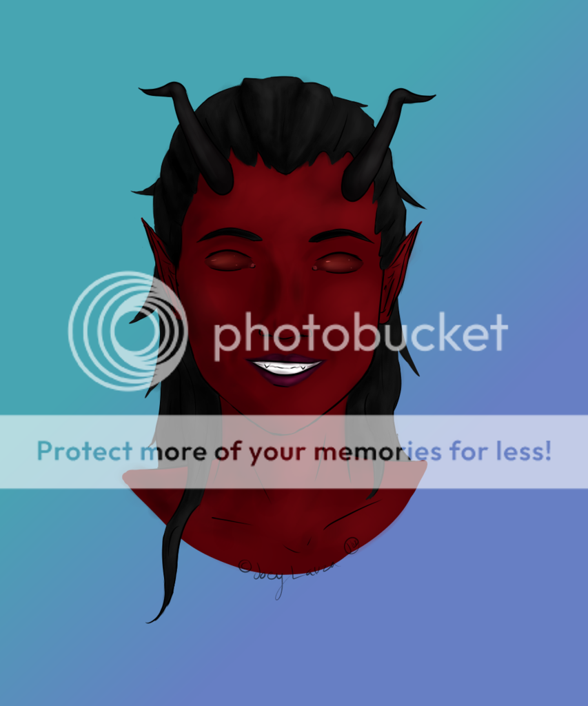
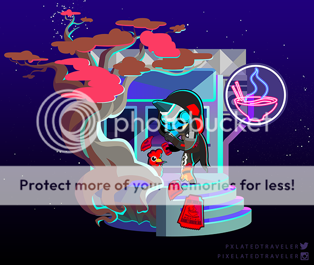
- by DubstepPirate |
- Painting And Drawing
- | Submitted on 07/25/2011 |
- Skip
Comments (5 Comments)
- DubstepPirate - 07/25/2011
- hehe, maybe i wrote without sense my comments, i have a bad english, because i dont speak it in my country lol, but i have a good sight, i think i see best than you, because i dont use glasses(maybe you if), ty for the critiques
- Report As Spam
- Grimwyse - 07/25/2011
-
Nice? You can't even see it. Second it was a list, what sort of person doesn't read. Don't worry, it's rhetorical.
It's 1/5
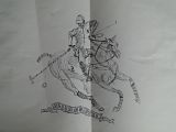
Critiques? Sure, the back leg of the horse is extended forward too far. Has too many bends/knees . And is too long. - Report As Spam
- DubstepPirate - 07/25/2011
- What a nerd, who resizes his nice work with paint??
- Report As Spam
- Grimwyse - 07/25/2011
-
I would suggest you take the original picture, open it in a photo editing software (Paint, Photoshop, Whatever) and resize it down so photobucket doesn't do it automatically.
Else you can't see anything. - Report As Spam
- DubstepPirate - 07/25/2011
- WTF , thats not the original size > sad (
- Report As Spam


