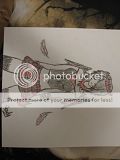
- Title: Wolfehh
- Artist: Hilda-san
- Description: ik its really bad and looks kinda fat, but its all i had on short notice... if i hadent shaded in you could see more detail but.... yeah... plz rate honestly and i would always appreciate comments...
- Date: 07/22/2011
- Tags: wolfehh
- Report Post
Comments (5 Comments)
- Hilda-san - 08/21/2011
-
the thing is for some reason i draw better on lined paper that white for some reason, but thanks i will do better next time^.^
- Report As Spam
- Lady_Down - 08/17/2011
-
i agree with clamcakes, the anatomy is quite good, some minor problems, but easy to solve smile
shadows help a lot to make the wolf look more realistic wink
the way you photographed it, make it look disproportionated... try next time to take the pic while daylight and from right above, that way it will look quite representable wink
and please, try to use white paper instead of a lined one ^^,
my tip, have always white paper with you ;P
3/5 - Report As Spam
- Hilda-san - 07/28/2011
- (clamcakes-) its ok, im glad u told me, i will totally try to put the tail higher next time, thanks^.^
- Report As Spam
- clamcakes - 07/28/2011
-
It looks like you have the basic anatomy down really well. It's actually not fat at all. The only thing I see that might need work is the tail. It's placed a little low and looks like it's coming right out of it's rear! A tail is like a continuation of the spine, so maybe put it a little higher up next time.
I'm sorry if you didn't want a critique... It's kind of a habit!
This looks very nice though. c: good job - Report As Spam
- Raining Led - 07/23/2011
- ok, thats a waaay better wolf than i could ever draw. i specialize in people. 5/5 (:
- Report As Spam


