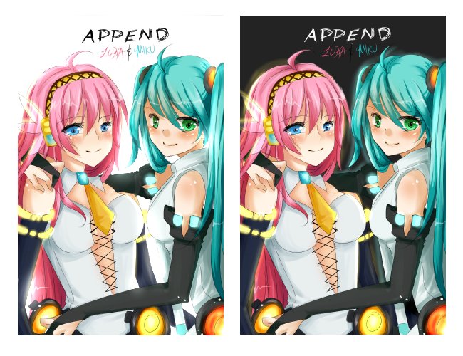
- Title: Miku and Luka's APPEND
- Artist: Lihein
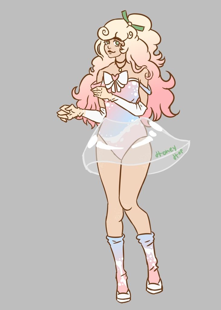
- Description: Miku's append along with my design for Luka's append. Couldn't decide which version i liked better so i posted them both. :)
- Date: 06/02/2010
- Tags: miku lukas append
- Report Post
Comments (7 Comments)
- Astral Only - 11/14/2010
- I like the darker one.. but you have some minor anatomy issues you need to work out. Miku's hand on Luka's shoulder seems awkward and so does Luka's left (our right) shoulder.. it just disappeared. Miku's torso confuses me.. In the dark version, there's a definite line.. but to the right of it, there are cloth folds that make it seem like the torso stars there.. The face/eye placement could just a tiny tweak, but I have the same problem to I sympathize.
- Report As Spam
- Yume Phantomhive - 06/26/2010
-
great 5/5, please coment:
http://www.gaiaonline.com/arena/art/photography/vote/?entry_id=102202043#title - Report As Spam
- xPaINxOfxLoVEx - 06/21/2010
- X3! This is mai fav drawing of Luka and Miku together that you made. 5/5!
- Report As Spam
- miomi_san - 06/05/2010
- i like the 1th one
- Report As Spam
- rainbowryda - 06/05/2010
- i like them both, but if i had to choose one i would pick the second one with the black background smile
- Report As Spam
- Jampaii - 06/04/2010
- very nice i would like to put that in a gallery
- Report As Spam
- Poisoned by Pandas - 06/03/2010
-
i luv them both
adding to my favs
5/5 - Report As Spam


