- by trissygirl |
- Painting And Drawing
- | Submitted on 07/07/2009 |
- Skip
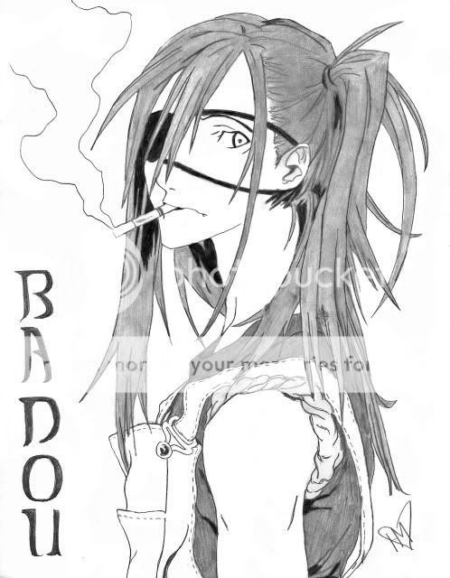
- Title: Itachi
- Artist: trissygirl
- Description: LOL This is something I did at lunch >.> It's only a little picture but It turned out alright LOL and he's my fave character : D what do you guys think?? does Itachi look better with hair down or up?
- Date: 07/07/2009
- Tags: itachi
- Report Post
Comments (3 Comments)
- Klaora - 07/07/2009
-
The folds are very well shaded. That is one of the things I enjoy about this piece. However, try to work on learning how folds go. Some don't quite make sense.
I don't know what's going on with the arms. It's very unclear and confusing. One of the arms is WAY too long.
Make sure the hair is even. Don't be afraid to try some textures.
It's too bad that this smudged. D=>
For a quick sketch at lunch, this is very nice. Keep up the good work. - Report As Spam
- Kaminari Katsuya - 07/07/2009
- Woah, You drew that!? I'm impresed! perfect ten!
- Report As Spam
- Ispin Charles - 07/07/2009
- very nice 5/5
- Report As Spam


