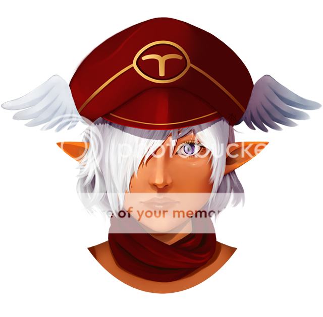
- Title: LuLu
- Artist: WiCi
- Description: this is my 2nd try to do a portrait... just used pencils, i hope u like it
- Date: 04/07/2009
- Tags: luluffx
- Report Post
Comments (7 Comments)
- Vitaliani-S - 04/07/2009
- wow thats truly a work of art your great at sketching i wish you alot of luck in the future
- Report As Spam
- HikkiAyuLion - 04/07/2009
-
Damn, ur good at sketching o.o
I LOVE LULU X)
the only 'half' complaints i could ever have about it is that the eye's distance from the mouth makes the nose look a little long ^.^'
and she gots no cleavage T^T lulu has cleavage.
still 5/5 u have amazing drawing skills =3
the hair.. um.. objects... catch my eye especially X3 never ever could i make a picture that clean w/ pencil! My favorite part though is the layering of her hair, and the eye's smexy too =O
Ur amazing *.*
- Report As Spam
- inuyasha luffer - 04/07/2009
- I would have to agree with some of that. her eye is a tad bit to big, but very well done, it also seems to be a little high for her face. the right side of her nose is out of proportion with the other side. I Think it's done really well though, with the intensity of the eye and lips it makes the skin look soft and life like. You might want to add a little shading to her left cheek to make it more 3D....IT is really good thought I give it 4.5/5 and I love LuLu! woot! ^.^
- Report As Spam
- Crimson Ninja Ai - 04/07/2009
- the eye is too big for the face and it also may be too high, in addition the nose is too small and the lips need to be a bit wider; depending the eye ( if you draw a straight line the edge of the mouth should line up with the center of the pupil, lastly the transition between the nose and the bidge of the nose into the cheeks and eyes makes her face look a little flat, some highlights in the hair and face and a larger scale of different grays will help this piece a lot. good start though razz
- Report As Spam
- Vengeful Dreamer - 04/07/2009
- It's a fantastic picture. I'd like to give you a few pointers, though: the neck is a little on the thin side, and the nose might be a little too long, a little too straight. The chin looks like it might be going too far to the right, be careful not to lose the proper head shape when partially covering it with bangs.
- Report As Spam
- Alcmaeon - 04/07/2009
-
it's pretty unique and good around it's shading,the
detail is also great.
- Report As Spam
- Sluty Black Bird - 04/07/2009
- love it i love how you used shading love it 5/5 amazing
- Report As Spam


