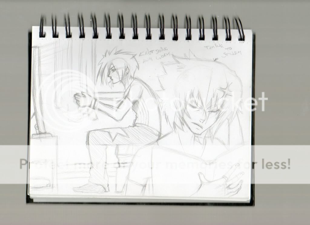
- Title: The 2 shades of Squall.
- Artist: Shining_K
- Description: Grr..Got deleted by mistake. Anyways, resubmitting with a little update. The contrast seems to bring out the pencils better. The bigger, better, original version can be found at http://members.aol.com/shoxv/squall2.jpg
- Date: 02/26/2004
- Tags: finalfantasy
- Report Post
Comments (7 Comments)
- DSHeartless - 03/02/2004
- good shading. i really like the whole "two views"thing, i like doing that myself.
- Report As Spam
- the-ben - 03/02/2004
- holy s**t thats a awsome picta of squall!!! you rock =P
- Report As Spam
- Buffy the Vampire Slayer - 02/29/2004
- nice pencilwork...I've never seen Squall look so unattractive.
- Report As Spam
- Butter Flavored Condom - 02/29/2004
- Somehow, his closeup looks older, and his full-body version looks younger!
- Report As Spam
- Aquatina - 03/01/2004
- His wrinkles don't look right. His body looks like it's melting.
- Report As Spam
- hold_the_gnome - 02/29/2004
- WOW *majorly jealous* ^^
- Report As Spam
- Lunavail - 03/01/2004
- Very good drawing. You make Squall look really ugly though.
- Report As Spam


