- by octanedude |
- Painting And Drawing
- | Submitted on 10/15/2008 |
- Skip
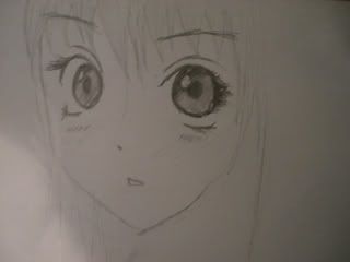
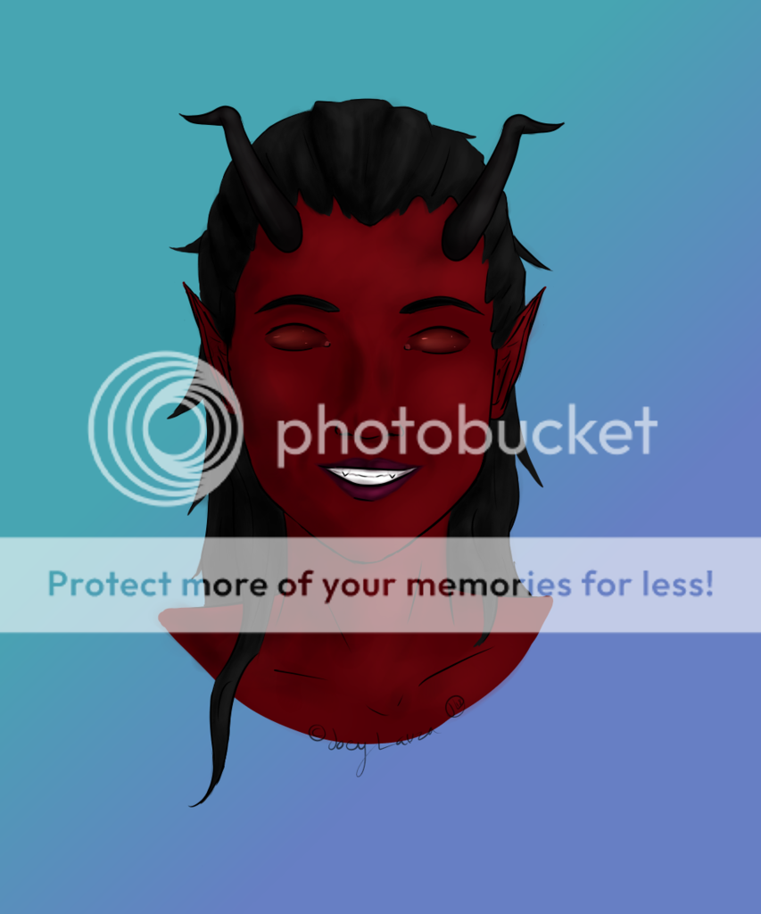
- Title: My first anime drawing
- Artist: octanedude
- Description:
- Date: 10/15/2008
- Tags: first anime drawing
- Report Post
Comments (7 Comments)
- AntiGuardian - 01/09/2010
- Didn't mean to say doesn't. +x+
- Report As Spam
- AntiGuardian - 01/09/2010
- Just because he doesn't add a description saying he actually drew it wont make it suddenly become true. You just have to believe like just the others that they actually drew it themselves, not tracing it or anything. But sadly the drawing doesn't look that good. You barely managed to make the eyes look good, but their position isn't right. Good for a first try though.
- Report As Spam
- Parsleys Thyme - 10/09/2009
- (Coutinuation) My first ever anime drawing was a drawing of Kaoru from Rurouni Kenshin (which is in my gallery), and it is not this good. I'm not saying I'm the ost amazing artist in the world. Believe me, I'm not. But I know I'm not a bad artist. And I just don't believe that you drew this. Sorry, buddy. You're gettin' a 1/5 from me. It's not believable to me.
- Report As Spam
- Lieutenant Shotgun - 10/09/2009
-
Continued... Yes, humans are asymmetrical, but in drawing it looks better when they aren't. You should also make the hair a little less blocky and more stringy like real hair. The nose should have some more definition as well. And next time, you should do a full body shot, or leave more room around the drawing... It makes me feel kinda claustrophobic.
Oh, and, you should scan pictures directly to your computer instead of taking pictures. - Report As Spam
- Parsleys Thyme - 10/09/2009
- MAKE A DESCRIPTION. For some reason, I don't believe that you drew this yourself. I believe that you traced it, ONE because you say it is your FIRST anime drawing, so for some reason I don't believe you could have POSSIBLY drawn this your first time. And also the fact that you don't have any description what-so-ever, it's really not helping. ALso, it really bugs me that some peope, when they have no descriptions, but have a really good drawing. It really really bugs me.
- Report As Spam
- Lieutenant Shotgun - 10/09/2009
-
You did well, but this isn't anime. Anime is animation. This is clearly not animated. >.>
It's good, but the left eye is too angled and the bottom and top eyelashes are uneven. The eyebrows are out of ailgnment, too. If they're supposed to be like that, you shouldv'e defined it more. And you should work on making eyelashes a little less this or at least more symmetrical. (I have more to say, but it doesn't fit.) - Report As Spam
- Zephyr Aryn - 04/07/2009
- It's pretty good, but be careful with the eyes, particularly the irises. the one on the right looks pretty good, but the angled one on the left is at too much of an angle, getting rid of some of the white area around it. However, you have a good start! (Angles are difficult.)
- Report As Spam


