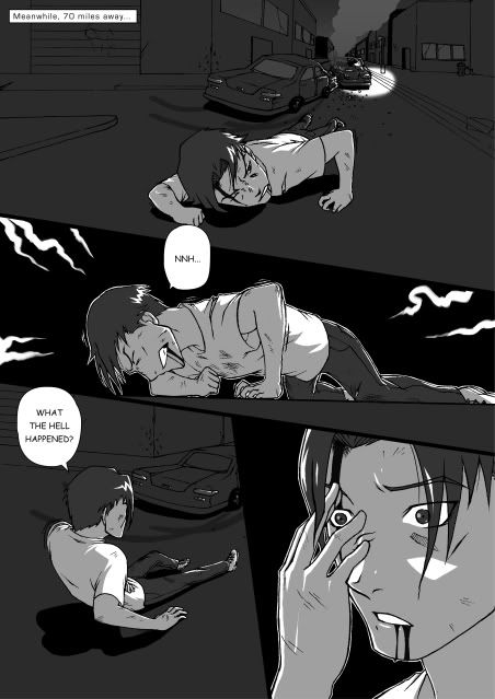
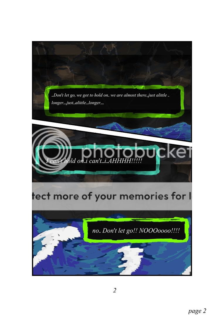
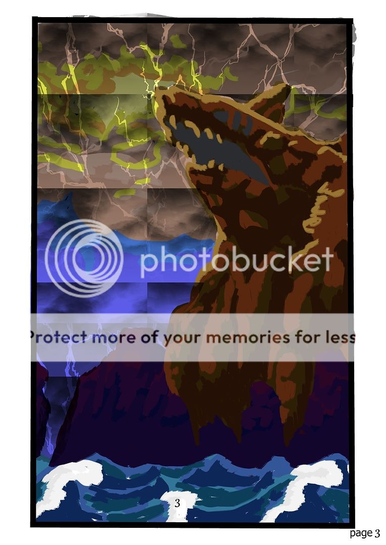
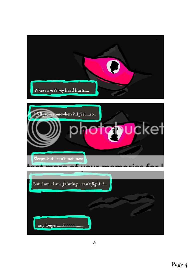
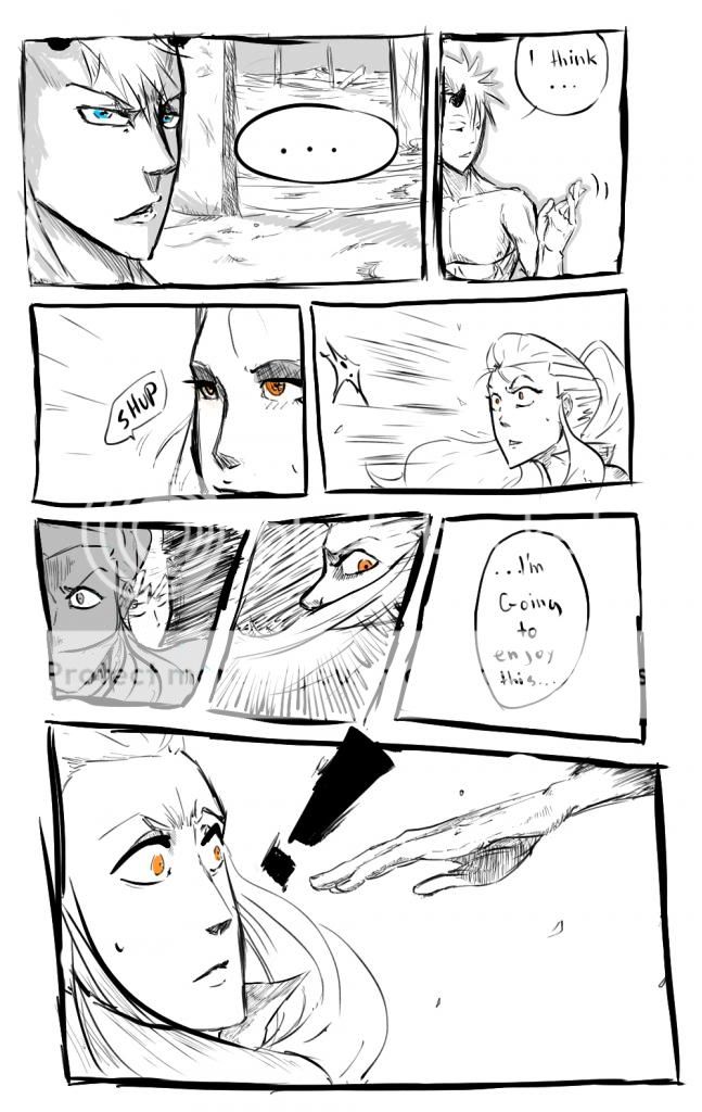
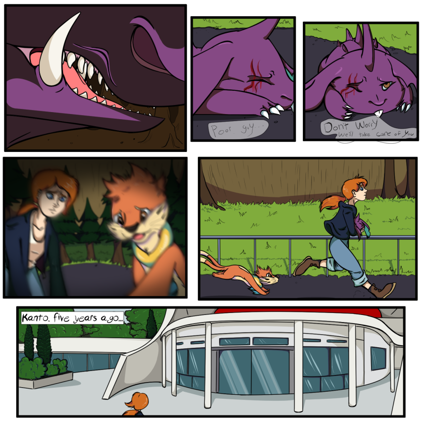
- Title: Blaze X - Chapter 1 Page 4
- Artist: Crater_C
-
Description:
Enjoy the manga :) ill update with new pages every couple of days so make sure to check back ^_^
Previous: http://www.gaiaonline.com/arena/art/comics/vote/?entry_id=102047291#title
Next:
Art by Will Hobden (me)
Story by Kei Alfonso - Date: 03/21/2010
- Tags: blaze chapter page manga anime
- Report Post
Comments (7 Comments)
- Crater_C - 05/13/2010
- Ive done that for other pages. I don't think you can judge the overuse of perspective over just one page :S
- Report As Spam
- Tobi-s Fangirl13 - 05/10/2010
- I think Riffick means the angles as well... and yes, if you use a different angle for almost every panel, it gets kind of boring... repeated angles for a straight line of, say, three panels with the same perspective will give a different angle a bit more of a pop. smile Not quite sure, since I can't read minds, but that's what I was thinking a bit too. This is EXTREMELY good, though panel three threw me off a little. 5/5
- Report As Spam
- Crater_C - 04/03/2010
- im sorry but that doesnt make sense to me. Why shouldnt i use perspective too much? i need it to make it look more realistic. If i didnt use it, it'll bore the eye even more than when i do use it.... I understand to not use it for every single panel. I wont use it when it's not necessary. But for shots like these, if i didnt use perspective it'll look flat.
- Report As Spam
- DivineHeresy113 - 04/02/2010
-
Great perspectives, try not to use to many though it bores the eye after a wile. Your anatomy is very well done!! glad to see someone on here actually using it.
5/5 - Report As Spam
- Crater_C - 03/23/2010
- Thank you smile im glad you like my work biggrin
- Report As Spam


